GEORGIA INSTITUTE OF TECHNOLOGY
Senior Designer · Brand Systems · Editorial Design · Print Production

Year
2014-17
Client
category
gRAPHIC
dESIGN
Intro
Georgia Tech is where my fundamentals come from: print production, brand systems, and the discipline of designing to a spec. The work ran in two modes. Most of it lived inside Georgia Tech's institutional brand, extending a rigid system across recruitment and athletics. One piece, the Philanthropy Quarterly, was the opposite: a blank slate I got to build an identity for from the ground up.


Institutional Brand Work
Most of my Georgia Tech work meant taking the institute's "Creating the Next" brand and pushing it further without breaking it.
Recruitment (the Road Piece). I refreshed the recruitment materials with Buzz Gold floods, chevrons in place of the original hexagons, and subtle scan-line and honeycomb texture, giving the system more energy while keeping it on brand. The result won a UCDA Award of Excellence in the Recruitment and Viewbooks category.


Institutional Brand Work
Acceptance Packet. The first touchpoint for newly accepted students, carrying the acceptance letter, deadlines, and deposit call to action. It also introduced a secondary color palette that extended the brand's visual range.


Institutional Brand Work
Georgia Tech Athletic Association. I was asked to bring the Athletic Association's strategic plan into brand while keeping the energy of athletics, using wide fields of white, silhouetted action photography, and Old Gold on chevrons and vector patterns. It worked well enough that GTAA adopted it as their 2016 branding, and it went on to billboards, tickets, TV commercials, and much more.


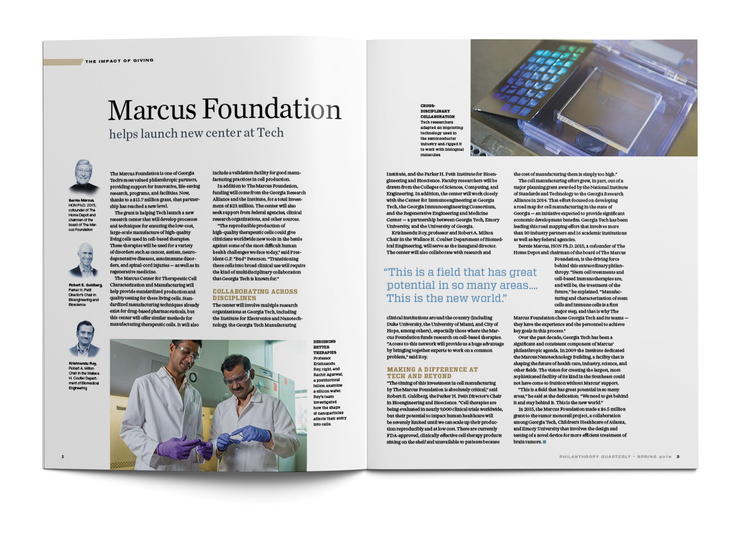
Philanthropy Quarterly
Philanthropy Quarterly was the exception, and the most creatively open project of the era. Georgia Tech's Development Office wanted a quarterly magazine to connect with past and prospective donors, sharing the impact of giving, naming opportunities, and the stories behind major gifts. It launched just as a big development campaign and its branding were wrapping up, which opened a rare window: instead of working inside an existing system, I got to define a fresh editorial identity for the publication from scratch.



Closing
Two ways of working, side by side: disciplined enough to extend a brand a whole institution relies on, and confident enough to build a new one when the page is blank. Both still show up in everything I design now.

KONTROLFREEK
Case Study
PLANESCAPE: ADVENTURES IN THE MULTIVERSE
Case Study
